Documentation
Find your way around
Start with a guide, look things up in the reference, or point your AI assistant at the docs.
How-to guides
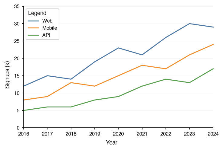
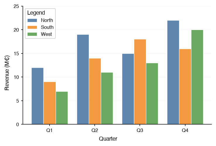
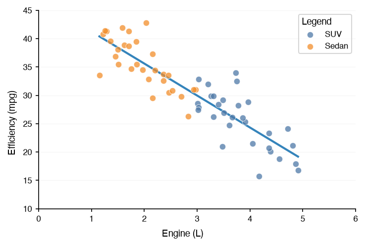
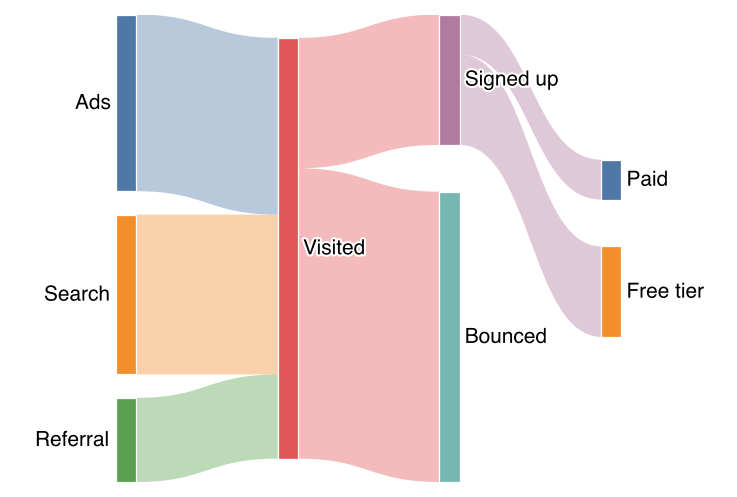
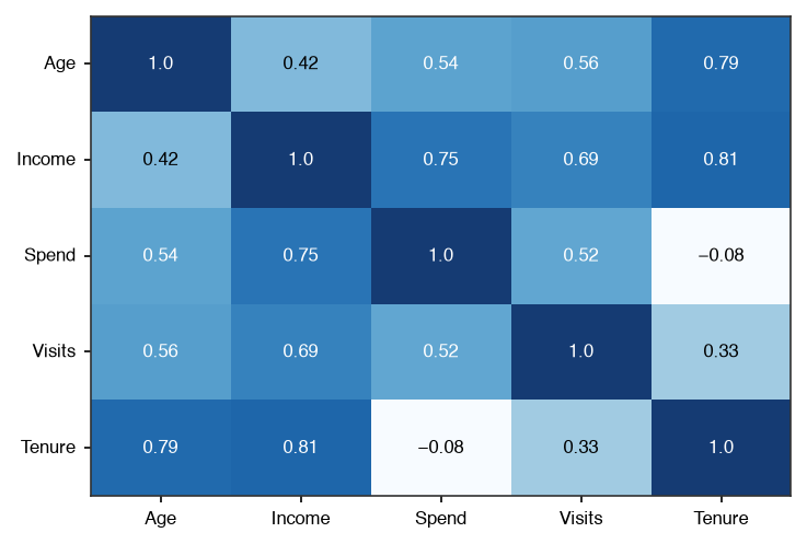
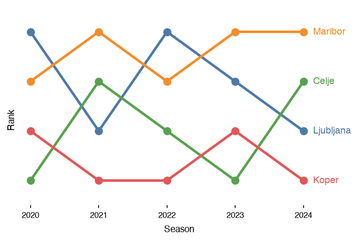
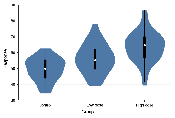
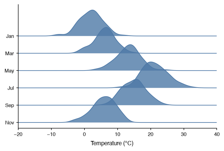
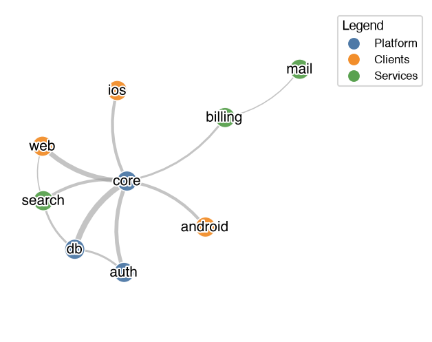
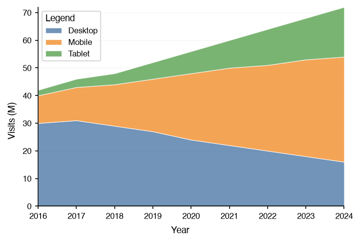
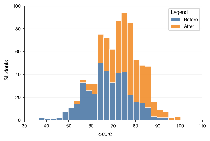
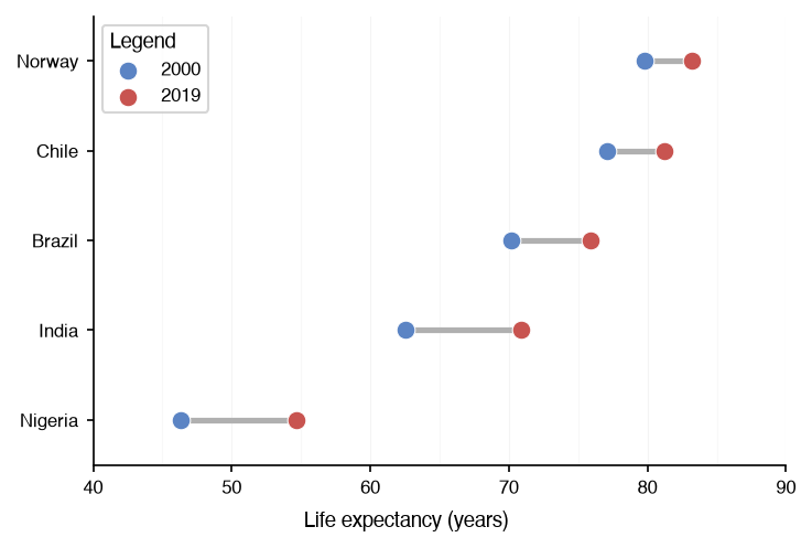
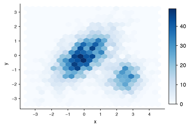
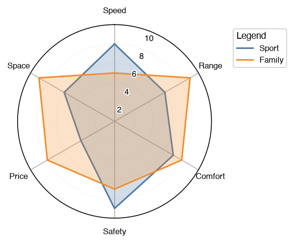
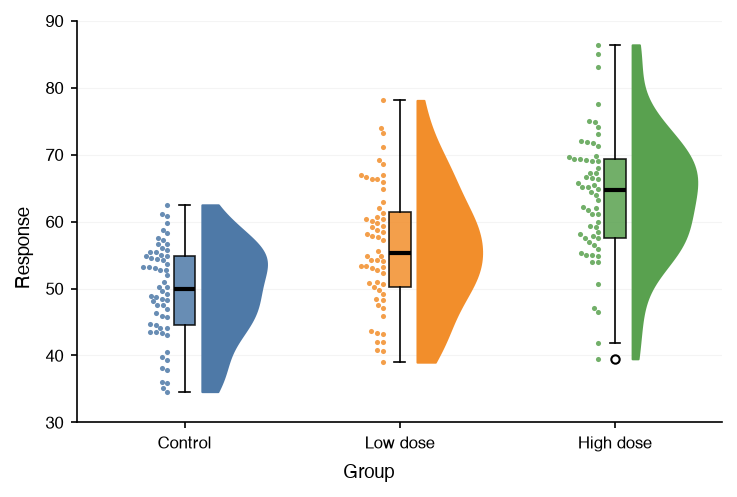
Every chart type, composition with Panel and Grid, styling, and the utilities, each a runnable notebook on real data.
Open the guides →API reference
Signatures and attribute tables for the charts, utils, config, themes, constants, and typings modules.
Browse the reference →Themes and styling
Seven predefined themes, the global config, colormaps, and emphasis for the series that matters.
See the theme gallery →Composition
Overlay charts on one axes with Panel, or lay them out with Grid. Grids nest.
Compose figures →AI assistants
llms.txt, per-page markdown, and MCP servers, so a coding assistant writes datachart code from the current docs.
Point your assistant here →Source and changelog
Bug reports, feature requests, and pull requests are welcome on GitHub.
Go to the repository →Install
Two commands, Python 3.10 or higher
Install from PyPI with pip or uv. Add the interactive extra for zoom, pan, and hover-to-inspect.
Every chart returns a plain matplotlib Figure, so anything matplotlib can do with it still works. See Saving Figures and Interactive Figures.
First chart
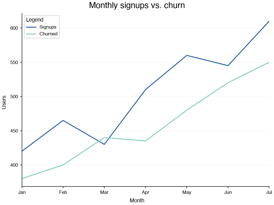
A line chart in one call
Every chart takes a list of series, each a list of dicts. Set a theme once and every chart follows it.
from datachart.charts import LineChart
from datachart.config import config
from datachart.constants import THEME

config.set_theme(THEME.INK)

months = ["Jan", "Feb", "Mar", "Apr", "May", "Jun", "Jul"]
signups = [420, 465, 430, 510, 560, 545, 610]
churned = [380, 400, 440, 435, 480, 520, 550]

figure = LineChart(
    [
        [{"x": x, "y": y} for x, y in enumerate(signups)],
        [{"x": x, "y": y} for x, y in enumerate(churned)],
    ],
    title="Monthly signups vs. churn",
    subtitle=["Signups", "Churned"],
    xlabel="Month",
    ylabel="Users",
    xticks=list(range(len(months))),
    xticklabels=months,
    show_legend=True,
)